Welcome to my portfolio
Hello! I am Deba. A Designer with nearly a decade of experience creating intuitive, meaningful, and visually engaging digital experiences. Passionate about interaction design, visual systems, and turning complex ideas into clear human-centered communication.
My work is at the intersectionality of Education, Marketing, Illustration and Concept Art.
E-learning modules, training programs and UX-driven learning solutions built for corporate environments.
Technicians needed foundational knowledge of hydraulic systems inside wind turbines — specifically three core components: Valve, Accumulator, and Filter. Hydraulic fluid behavior is dynamic and invisible in static diagrams which makes it difficult to understand without a proper learning experience, and the circuit symbols were completely unfamiliar to new learners. There was also no pre-existing training material on this topic, so the course had to be designed from the ground up with a strong focus on UX and visual communication to make the complex concepts approachable and engaging for technicians with varying levels of prior knowledge.
Step-by-step sequence version — To make the abstract concept of energy storage tangible, I broke the accumulator's working principle into 5 sequential steps and built a click-to-advance interaction. Each click reveals the next stage — from nitrogen fill, through fluid compression, to the bladder deforming under pressure — so learners build a mental model progressively instead of absorbing a static diagram all at once. This mirrors how the process actually unfolds over time, reinforcing cause and effect between the gas and hydraulic sides.
Symbol flip-card version — Since hydraulic schematic symbols are dense and meaningless to a beginner at first glance, I converted each control-element symbol into a flip card. The front shows the raw symbol as it appears on real circuit diagrams, and clicking flips it to reveal its plain-language meaning and function — pairing recognition with recall instead of forcing users to cross-reference a separate legend. This turns symbol memorization into an active, bite-sized interaction, letting users test themselves against each symbol individually before encountering it in a full schematic.
Section-reveal exploration version — For learners who already understand the sequence and want to explore specific components, I designed a click-to-reveal interaction where each labeled part of the accumulator — housing, bladder, gas valve, oil valve — expands with its own explanation on demand. This non-linear format supports self-directed exploration and lets users jump straight to the part they're curious about, functioning as a reference layer that complements the first, more linear walkthrough.
Cumulative circuit — all learned symbols placed inside a real-world system diagram
Learners progressed from zero hydraulics knowledge to reading real circuit diagrams — identifying components, understanding fluid flow, and recognizing industry-standard symbols in context.
This module was developed during the COVID-19 lockdown, when in-person training wasn't possible and learners were arriving with very different levels of prior knowledge about converter fundamentals. A one-size-fits-all module risked boring the learners who already knew the basics while losing the ones who didn't. The challenge was to design a structure that could tell the difference — testing learners upfront, then routing each person only into the sections covering what they hadn't yet mastered, while letting them skip ahead wherever they'd already proven competence. The module also had to make an inherently invisible process, the flow of electricity through a converter circuit, tangible and easy to follow without a classroom or instructor present.
Adaptive pre-test and locked module path — This menu opens with a mandatory basic electricity pre-test before anything else unlocks. The remaining three modules — power flow, circuit conversion, and protection — stay locked until that first test is passed, ensuring no one skips ahead without the foundational knowledge each later section assumes. Once a learner clears a module's test, its lock lifts and the path continues, letting people who already know the basics move through quickly while those who don't get routed through every step they still need — replacing an instructor's judgment call with a structure that adapts on its own.
Interactive converter circuit walkthrough — To make the invisible flow of electricity through a converter circuit tangible without an instructor present, I turned the schematic itself into an interactive diagram. Users click through a stepped navigation bar at the bottom — from power source to switch, through the IGBT bridge, to output — with each icon highlighting the corresponding part of the circuit as it's explained. Rather than describing current flow in text, learners watch it happen stage by stage on the same diagram an engineer would actually read, building intuition for the circuit's behavior at their own pace.
The diagnostic-first structure meant every learner finished the module at the same baseline, regardless of where they started. Those new to converter fundamentals got the full walkthrough on exactly the topics they needed, while those with prior exposure moved straight past what they already knew. This levelled the classroom coming into follow-up sessions — instructors could build on a shared foundation instead of re-explaining basics for some while losing others, and the final assessment confirmed that gap had actually closed before anyone moved on.
Technicians need to recognise and correctly operate the electrical equipment used inside a wind turbine nacelle — devices like multimeters and voltage testers — before they're ever handed the physical tool. Misreading a meter or skipping a dead-wire check isn't a minor mistake at height: it's a safety issue. The challenge was that this equipment can't be practiced safely or repeatedly in a classroom, and most learners had never held one before. The module needed to teach not just what each tool does, but how to physically operate it — which knob, which setting, which lead goes where — so that the first time a learner touches the real device, it isn't also the first time they've used one at all.
Interactive tool model — To provide hands-on experience without the risk of handling real equipment, I created an interactive simulation where learners can practice turning dials, attaching leads, and reading displays. This allows them to become familiar with the tools' operation in a safe environment before using the actual devices.
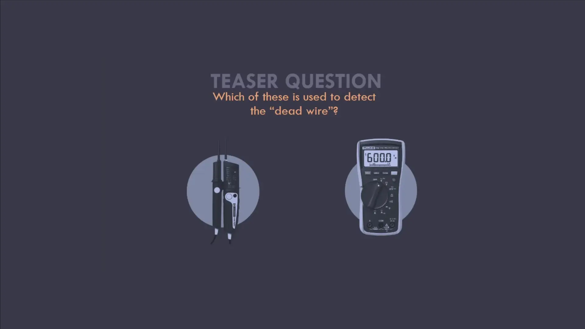
Scenario-based learning — By presenting realistic fault scenarios, learners are challenged to apply their knowledge and skills in practical situations. This approach helps bridge the gap between theoretical understanding and real-world application, ensuring that learners can confidently handle actual equipment when they encounter it.
Letting learners turn the dial and choose the wrong tool first, inside the module, meant the real mistakes happened somewhere safe. By the time technicians picked up an actual multimeter or voltage tester, the controls were already familiar and the decision of which tool to reach for wasn't a guess. The scenario-based ending also gave instructors a clear read on which learners could apply the tools to a real fault, rather than just recite what each one does.
Brand identities, visual systems and graphic communication — from guidelines to finished assets.
Navaliga Store sells football jerseys handmade in India to student groups in Bremen, Germany. The brief was to create a visual identity that sits honestly between South Asian craft tradition and European street football culture — rough around the edges, symbolic, and never generically sporty.
The work started on paper. Dozens of sketches, most of them discarded — figures, scripts, borders, badge shapes — all pulled from vintage Indian advertising: the bold flat mark, the confident line, the symbol that had to survive cheap printing and still read from across a street.
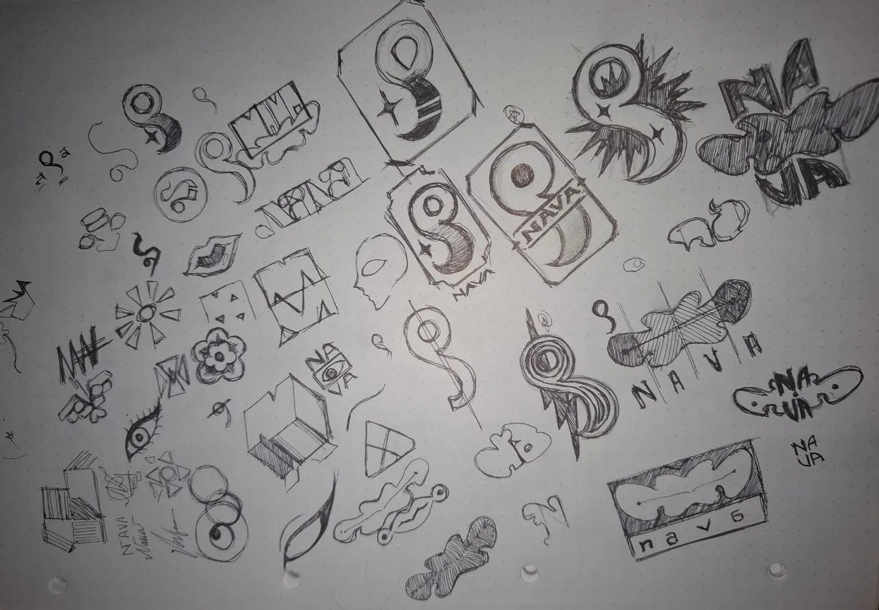
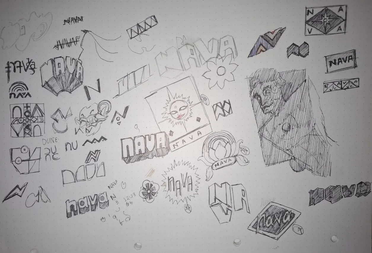
Sketch exploration — symbol directions drawn before anything was digitised
The final mark wasn't chosen for how it looked alone. It was chosen for what it could do next: a form modular enough to rotate, reflect and tile without breaking. One symbol that could generate an entire pattern system rather than sit still as a logo.
The brushwork stays rough — never cleaned up, never vectorised. A gradient sphere is the only smooth element, referencing the football and bridging craft with sport.
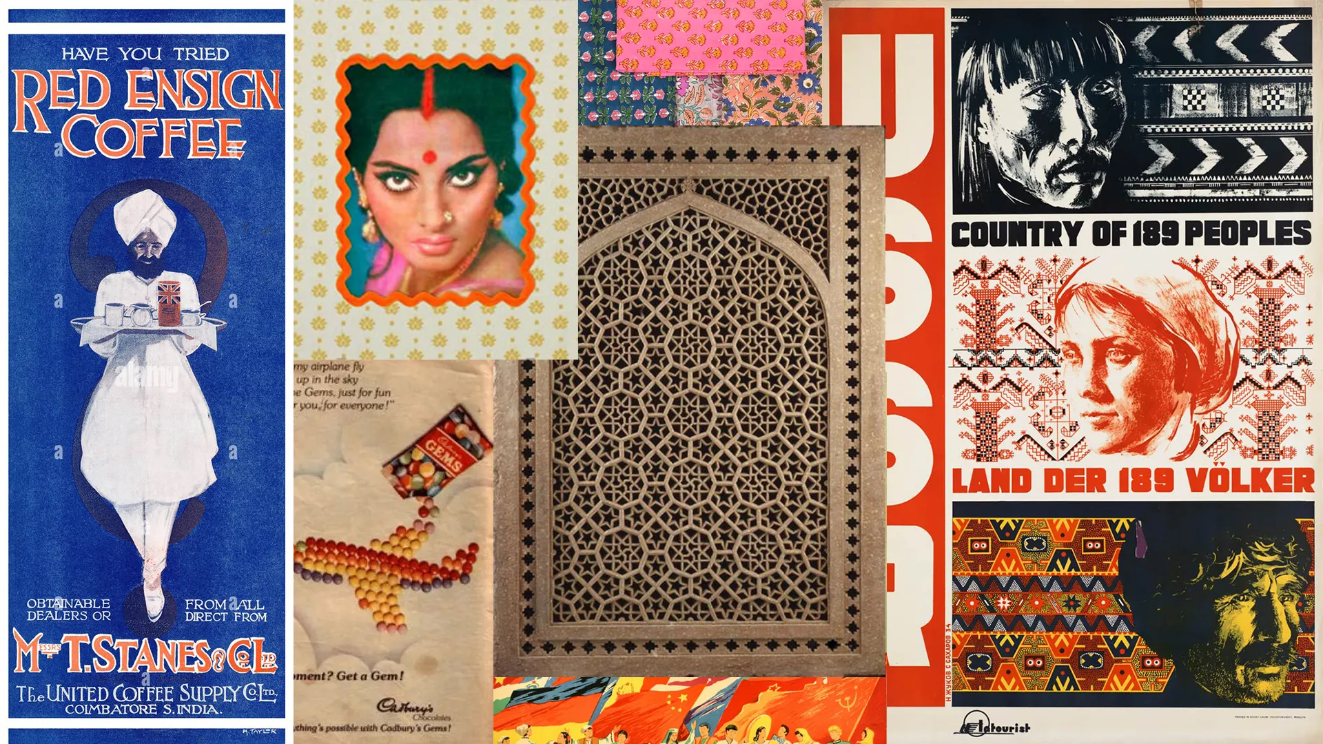
Reference — Vintage Indian advertising, soviet unifying posters and Mughal architecture patterns that have derived from Islamic geometric patterns
Times New Roman was chosen for its elegance. Set against the rough tessellations it does the opposite of what you'd expect from teamwear — restrained, serif, almost formal — and that tension is what holds the identity together. All caps italic for headlines, regular with 2% tracking for body.
White is the dominant surface. Red is used sparingly — only for symbol marks, accents and calls to action. Saffron appears exclusively in the gradient ball. Black carries all text and structure.
Brand Red
#EA3A01
Saffron
#FCC604
Black
#0D0D0D
White
#FFFFFF
White 60% · Black 25% · Red 10% · Saffron 5%
A single typeface throughout — Times New Roman. Made distinctive entirely through how it is applied.
H1 — Italic · All Caps · 0–0.02em
Navaliga
Store
H2 — Regular · All Caps · 0.2em
Welcome to · Catalog · Projects
Body — Regular · Sentence case · 0.02em
Teamwear made in India for student groups in Bremen.
A single hand-painted brushwork mark is the foundation of the entire visual system. Raw, uneven ink edges are intentional — this is the brand's most distinctive quality. All patterns and category icons derive from this one form.


Base symbol — on white · on brand red

Primary — on brand red

Base symbol — on white · on brand red
The symbol is tiled, rotated and reflected to produce a family of geometric compositions. All derive from the same base mark — what changes is scale, density, orientation and colour. These tessellations form the visual core of the brand.
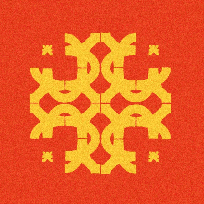


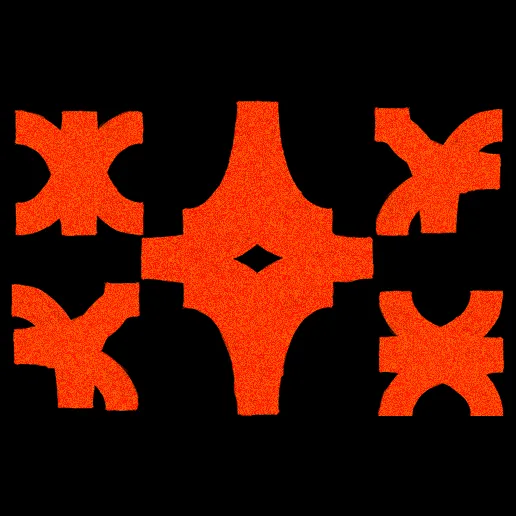
Four tessellation compositions — each a permutation of the single base symbol
Three tessellated compositions serve as category identifiers — not garment prints. They appear in the catalog, navigation and product pages to identify Jerseys, Shorts and Hoodies. The same mark at different densities and colour combinations.
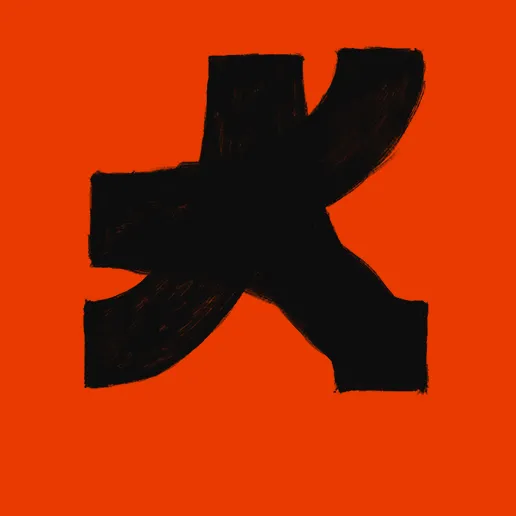
01 — Jerseys
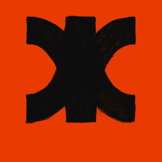
02 — Shorts
03 — Hoodies
Every image carries a grain overlay applied as a non-destructive adjustment layer — monochromatic, Gaussian, 8–14% at Overlay blend mode, 60–80% opacity. This unifies photography, flat colour and pattern into a single surface quality. No Navaliga image is exported without grain.
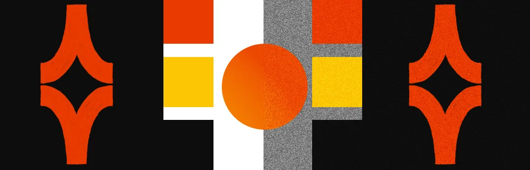
Pattern with grain overlay — the noise is visible across the flat colour field
White background throughout. Red appears only in symbol marks, navigation accents, and the thin corner markers that frame sections. Pattern never fills page backgrounds — it is contained to the narrow scroll strip and garment imagery.
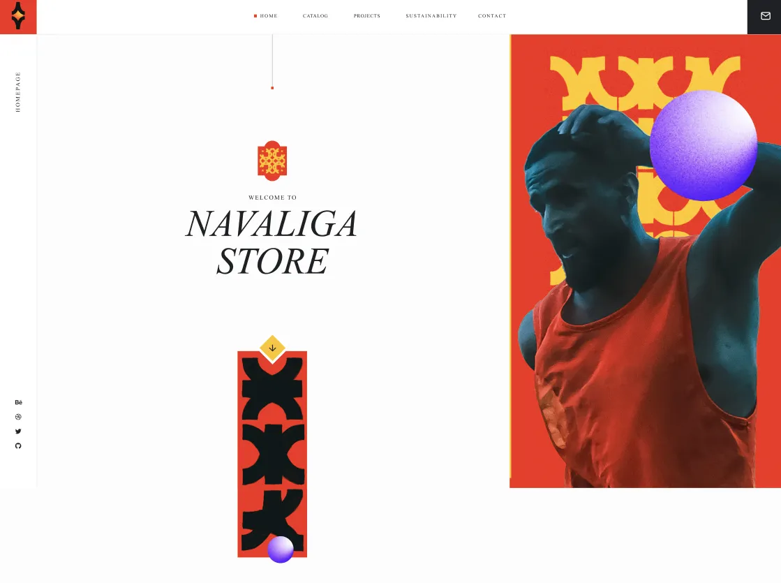
Homepage — white background, Times New Roman italic all-caps headline, red only in the corner mark
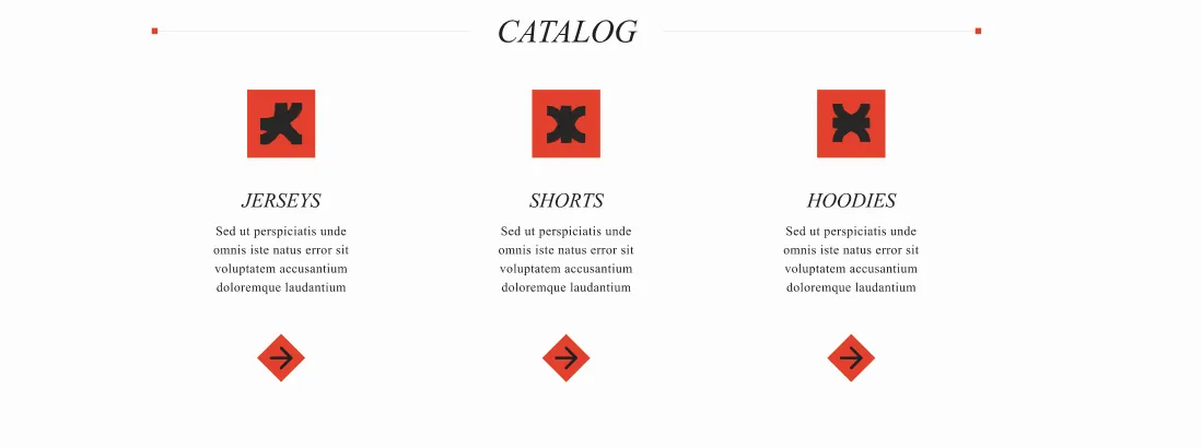
Catalog — category icons in red tiles
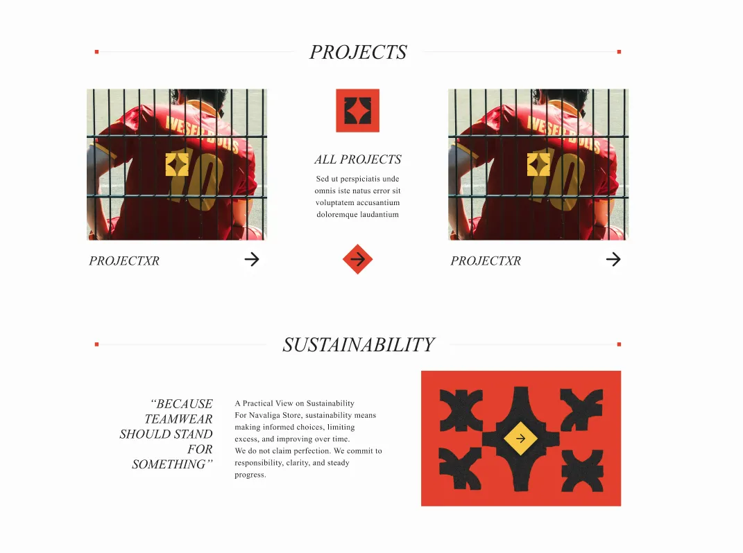
Website detail — red used only as accent
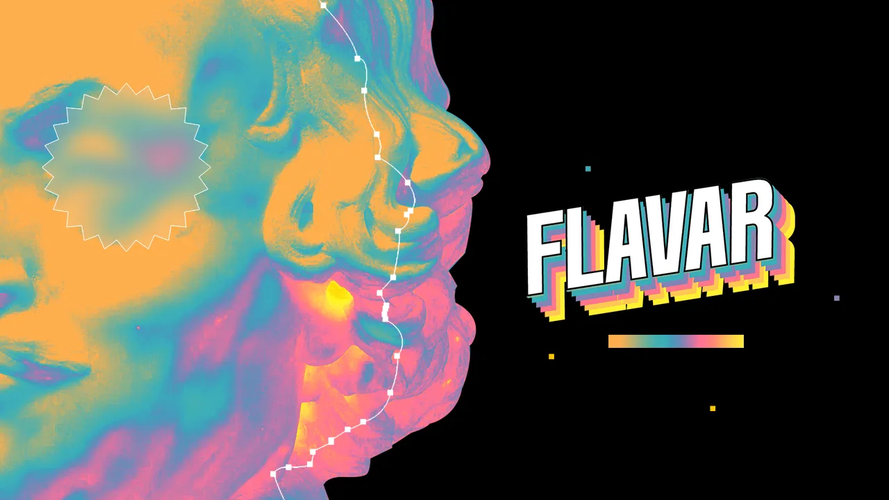
Flavar is an AI intelligence platform that decodes taste, culture, and decision behaviour — built for a world where food is identity. The brand needed a visual language that could hold two eras in the same frame: archival matter drawn with a pen tool, placed into vivid gradients that pulse with the energy of migrant kitchens and border-crossing flavours.
Archival, but alive. The starting point is old material — Victorian engravings, anatomical diagrams, museum still-lifes — all of it greyscale, all of it a bit dead on arrival. A curves layer brings it back in colours those images never had. That single move is the whole identity.
The subject is food, and food here is diasporic, mixed, borrowed from everywhere. Nothing monochrome, nothing singular — so the colour never sits still in flat blocks, it moves through the image as a gradient.
What comes out is loud. Deliberately. But loud on its own is just noise, so two things pull it back: the pen-tool paths stay visible — control points, handles, the outline of a thing being cut out — because they say someone chose this, and the glass panels sit on top to frame and organise. Extraction and structure, both left on show.
Glass on a CMYK gradient on Maximalism inspired designs. Those three have no business being in the same frame. The friction is the point, and the Flavar Yellow starburst is the one mark that punctuates it.
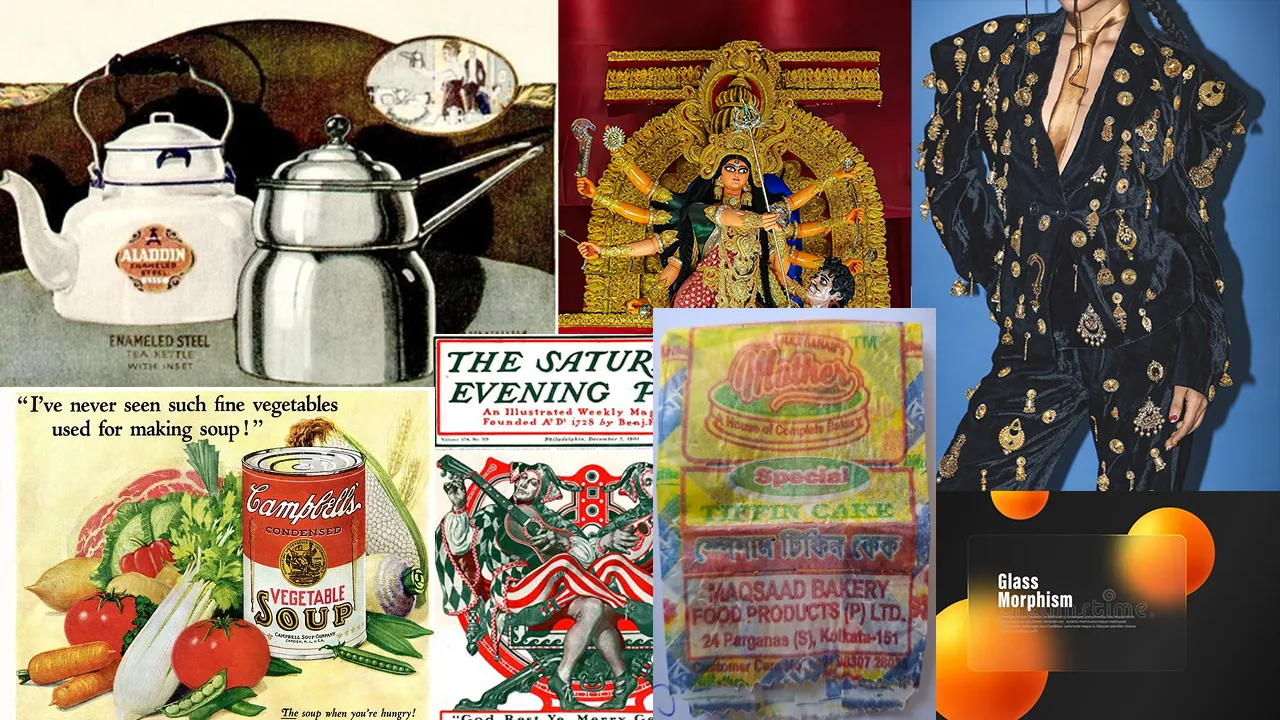
References — Vintage food advertisements, Indian Maximalism, and Glass morphism
The palette isn't really a palette. It's a curves adjustment layer — one recipe, applied to greyscale source imagery, that pulls colour out of pictures that never had any. The hues below are what comes out the other side, not what went in.
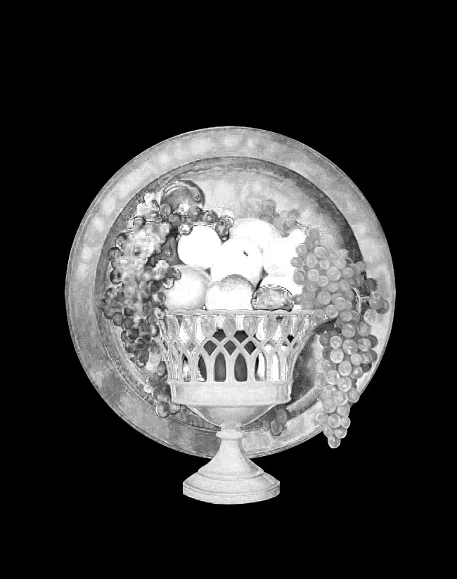
01 — Greyscale source
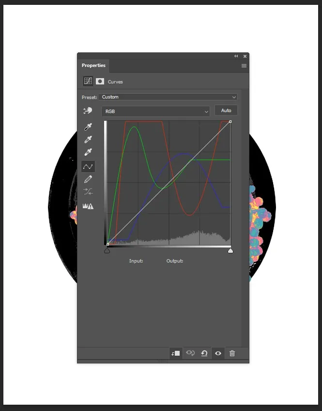
02 — The curves layer
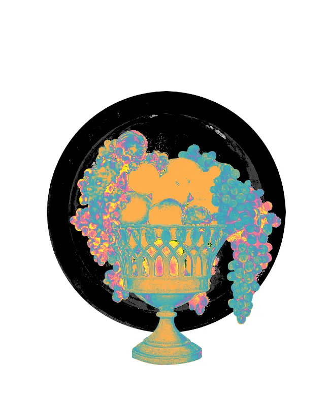
03 — Result
One curves layer, applied identically across the archive — every image comes out belonging to the same world
This is where the maximalism enters. The curves don't tint an image, they rebuild it — shadows go aubergine, midtones go teal, highlights blow out into yellow and pink. Applied across a whole archive it's genuinely a lot to look at, and that's intended. The four hues below are the ones the layer consistently produces.
Flavar Yellow
#F7C244
Signal Teal
#40C8C0
Deep Aubergine
#8A6CBF
Migrant Pink
#F0538A

Primary gradient — always horizontal, always this sequence, never flat fills
Left alone, that would be too much. So the glass panels and the dotted pen-tool edges do the opposite job — they cut the noise into readable pieces, frame what matters, and give the eye somewhere to rest. Maximalism from the curves, legibility from the structure sitting on top. That's the intelligence layer.
Two typefaces. One contrast. Fjalla One carries authority — all-caps for H1, navigation, labels, with 20% tracking at small sizes. Crimson Pro brings warmth — italic for H2, bold for H3, regular for body. Never set Crimson Pro in all-caps; its power is the contrast with Fjalla One.
Display — Fjalla One · All Caps · 8% tracking
FLAVAR
H2 — Crimson Pro · Italic · 300 weight
Taste is memory in motion.
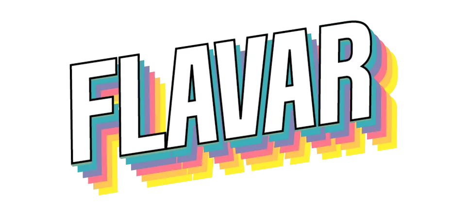
Logotype — chromatic shadow treatment in brand colours, offset lower-right. White fill with black outline is the primary letterform.
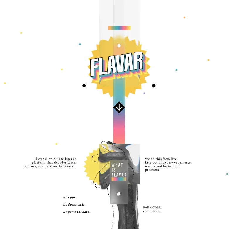
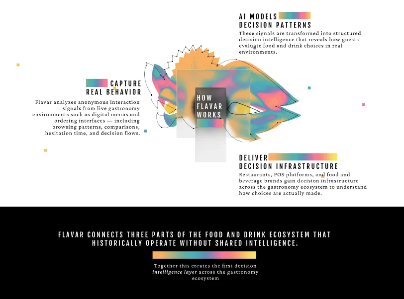
Homepage and How it Works — archival imagery with curves treatment, starburst badge, glass panels over gradient backgrounds
A collection of visual work spanning digital illustration, experimental art, and personal creative exploration.
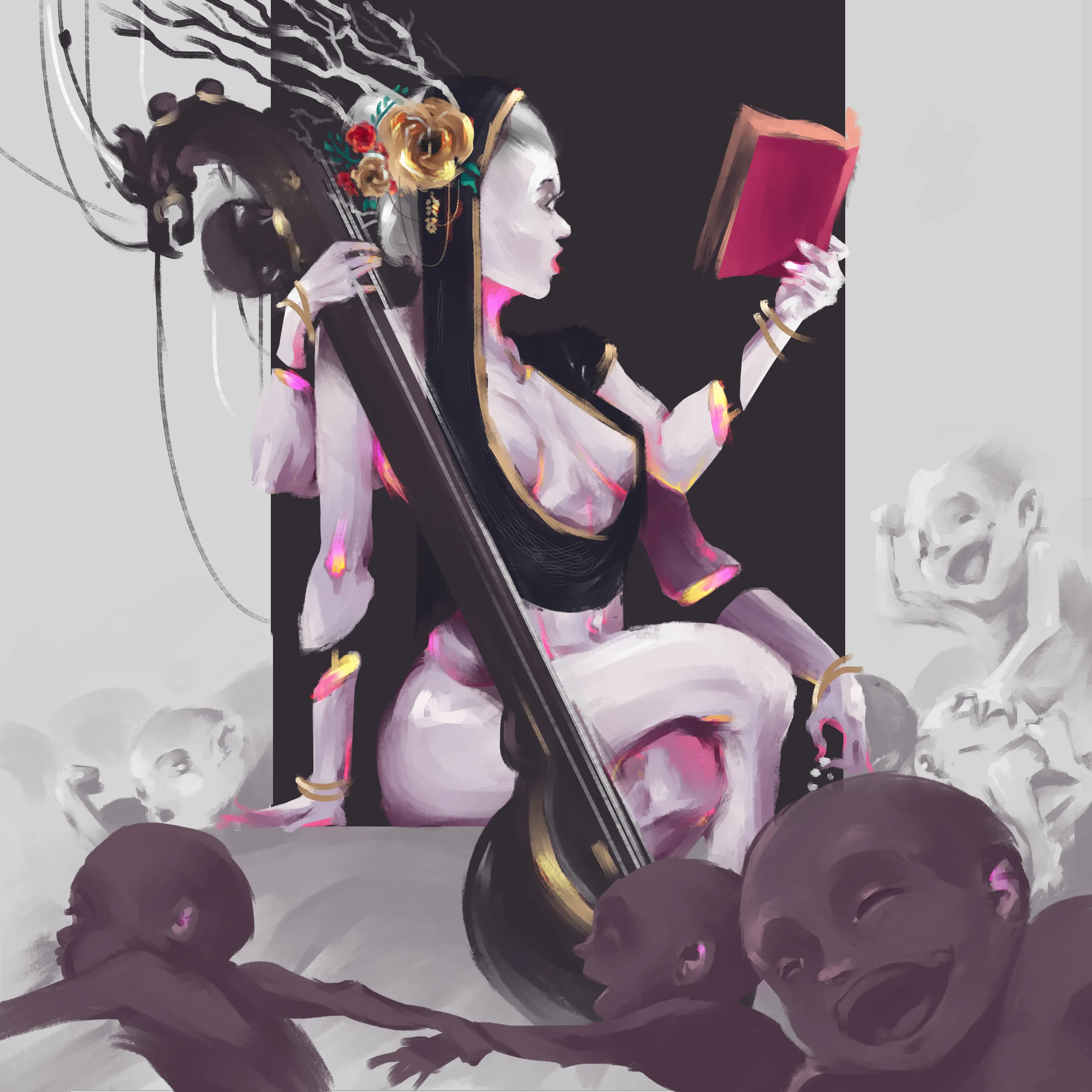
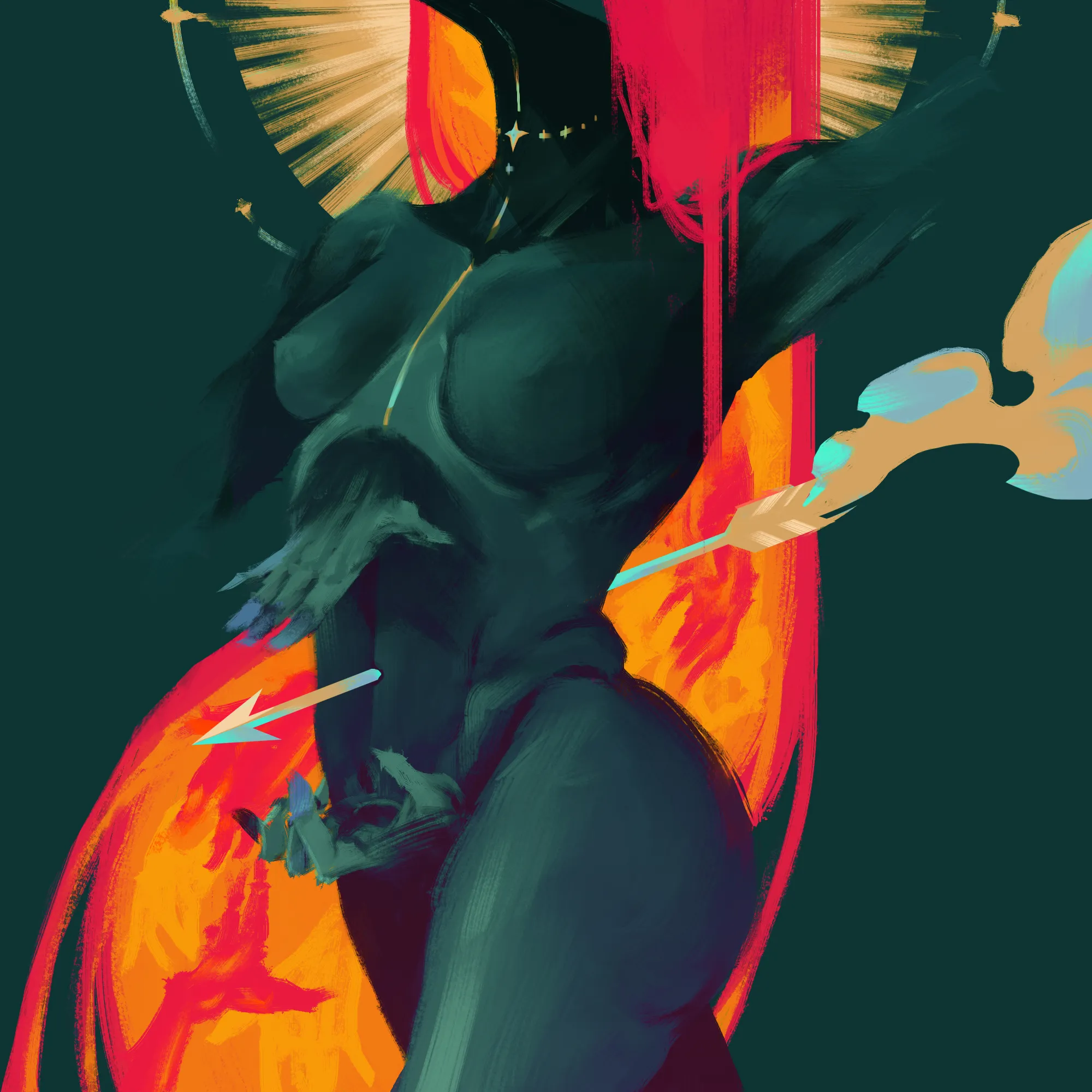
Left: A Goddess of Wisdom — Right: A Goddess of Sun
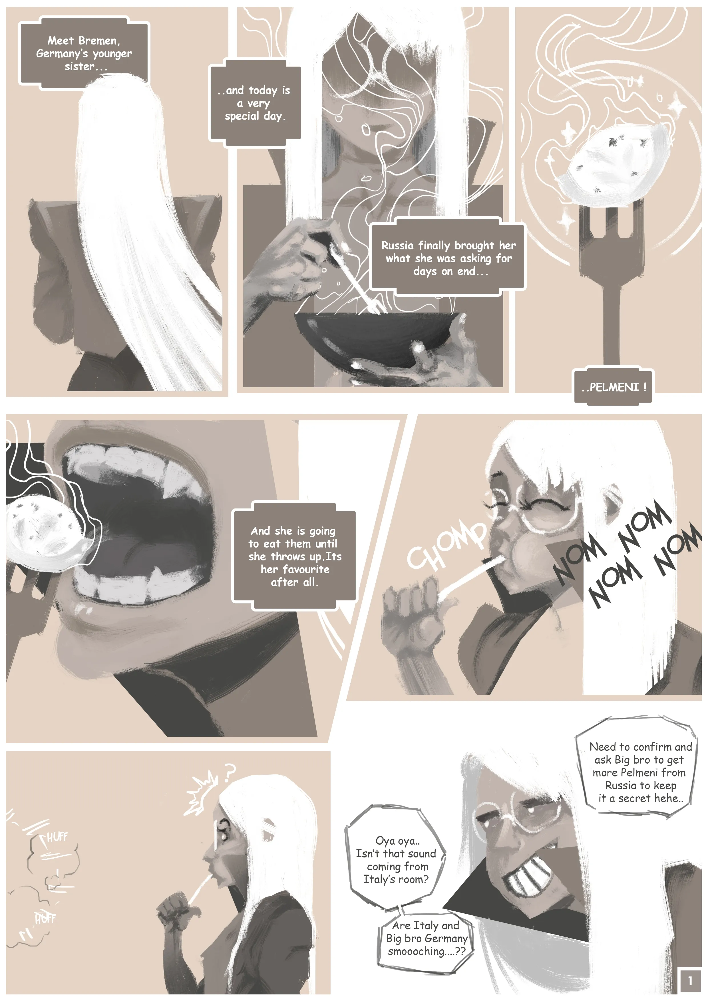
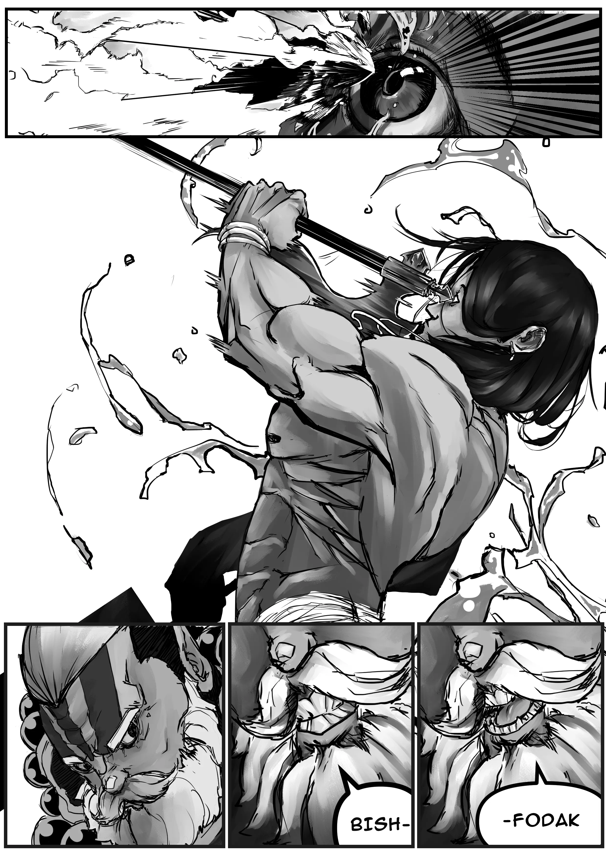
Comic works
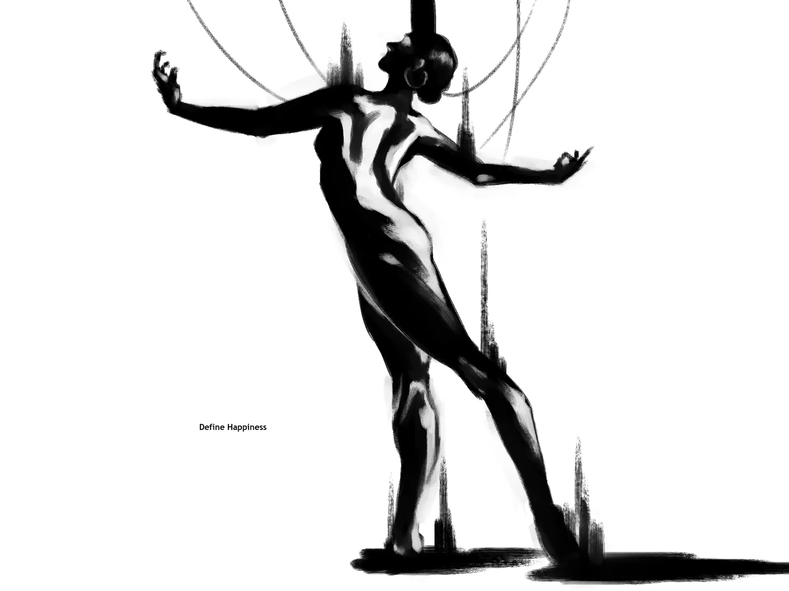
Brush practice
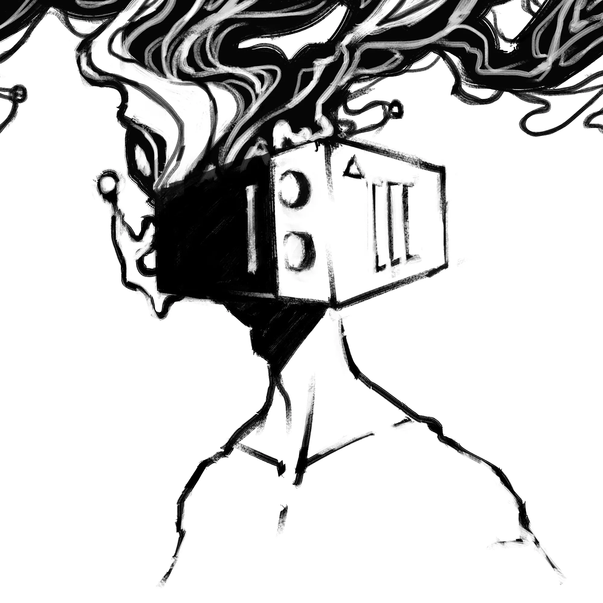
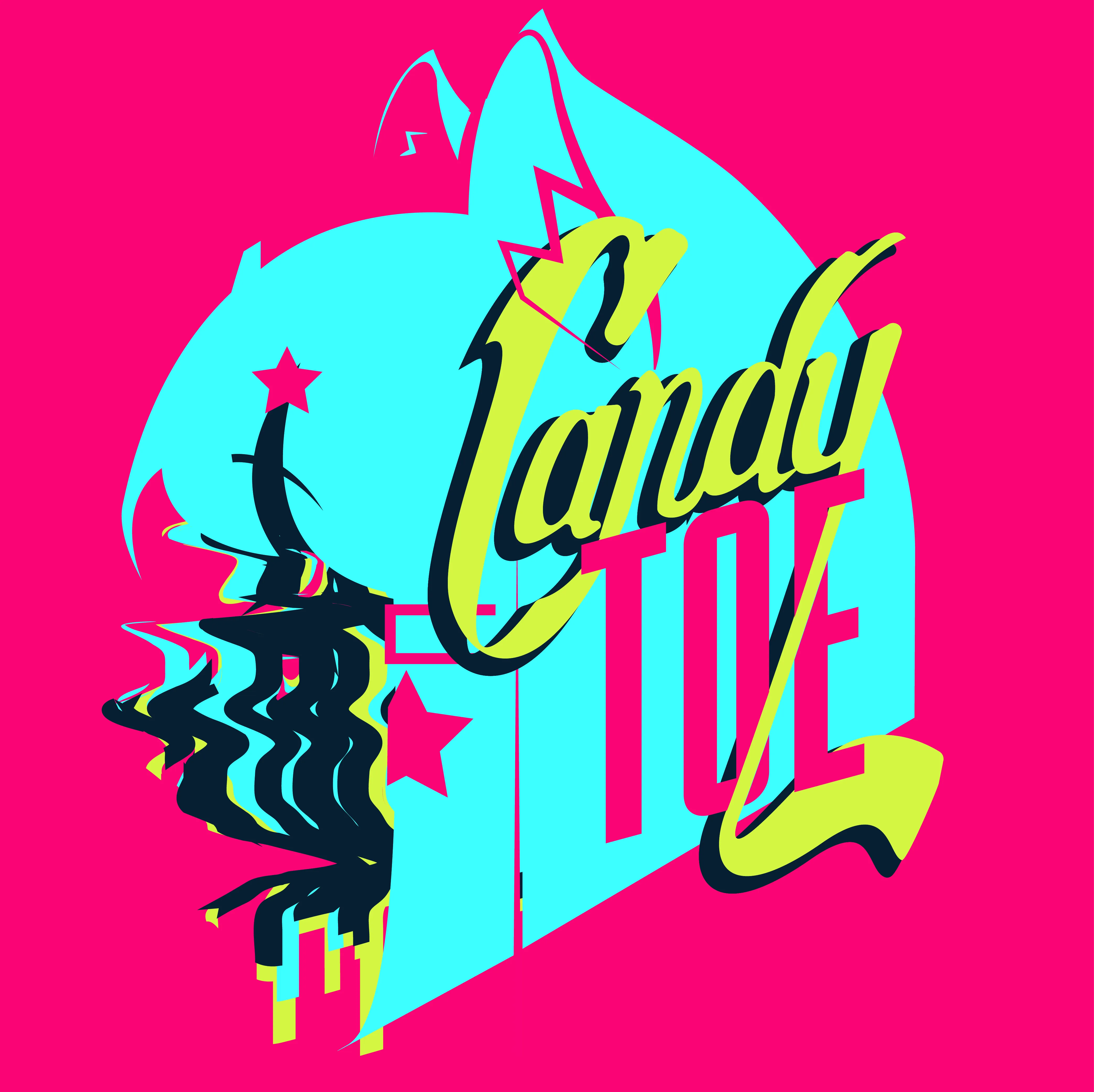

Stickers
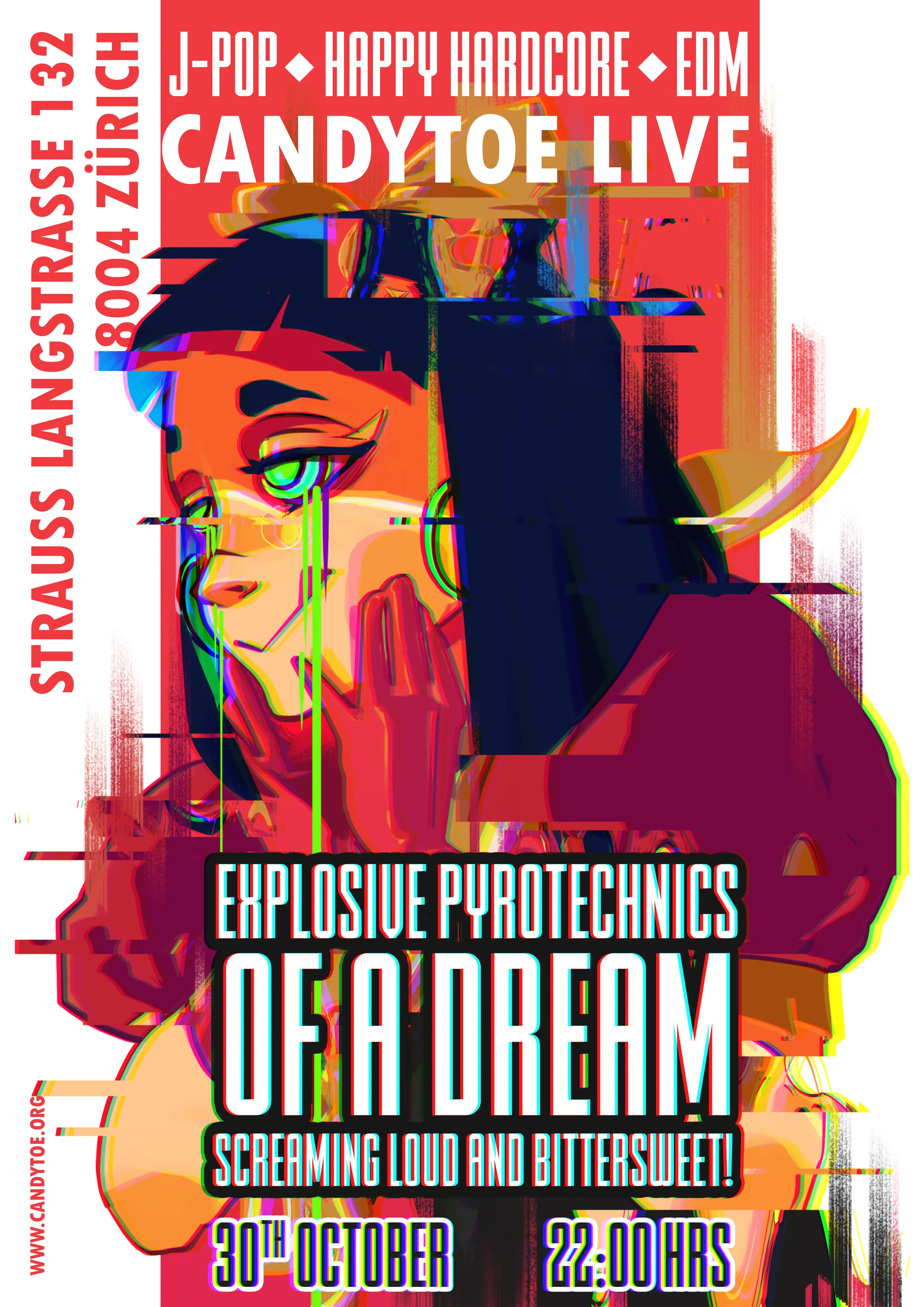
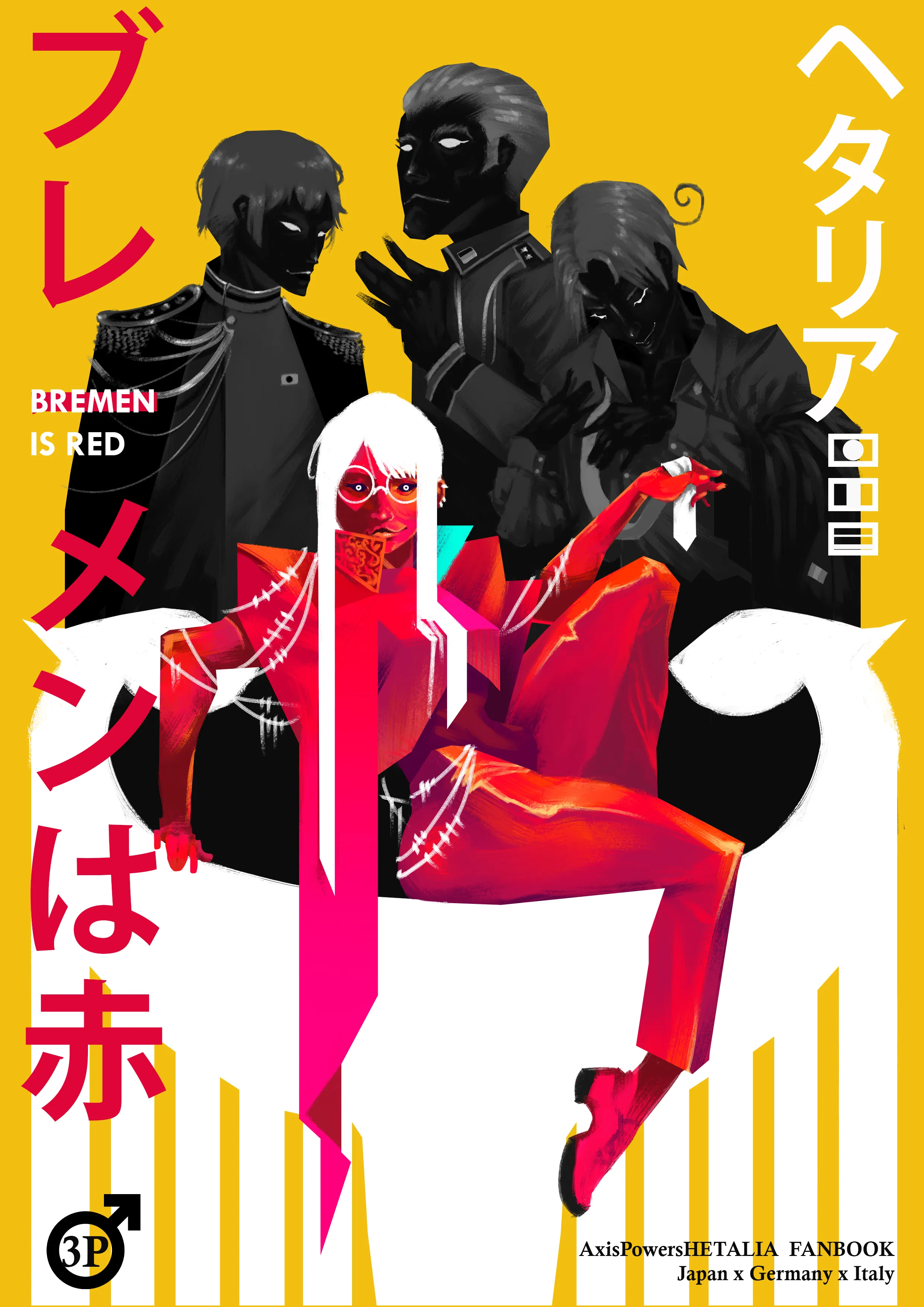
Poster format works
A work-in-progress system that turns physical gesture into a generative image prompt. A participant molds clay while holding a written prompt in mind; the hand movement is tracked with Mediapipe, read through Laban Movement Analysis, and translated into parameters that drive image generation — making the act of shaping something with your hands into an act of concept visualisation.
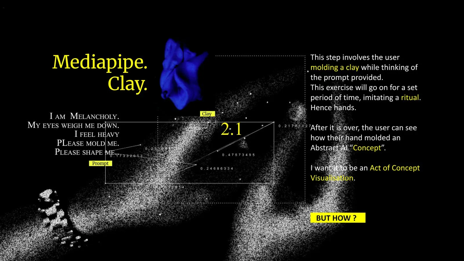
01 — Mediapipe & clay: gesture captured while the prompt is held in mind
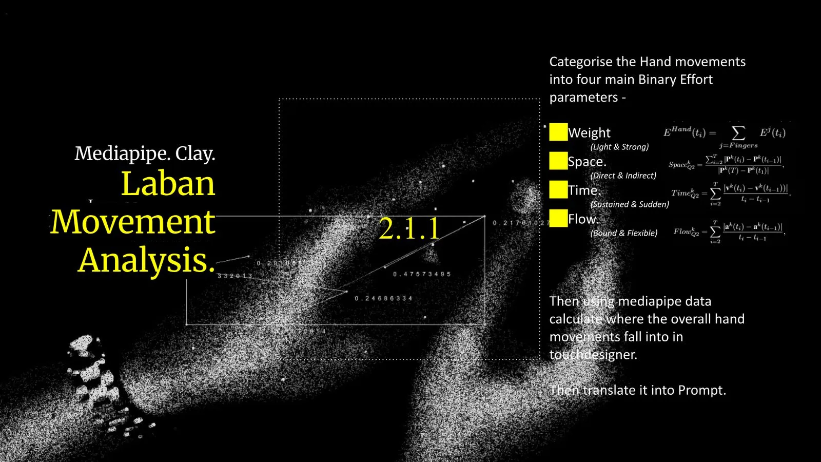
02 — Laban Movement Analysis: motion sorted into Weight, Space, Time and Flow
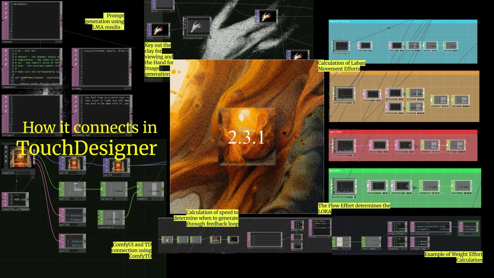
03 — The TouchDesigner network linking effort data, prompt generation and ComfyUI
Each image is generated from a single session — the prompt the participant held in mind, weighted by how their hands actually moved. The recurring frame-within-a-frame is not authored; it emerges from the effort parameters feeding back into the generation loop.

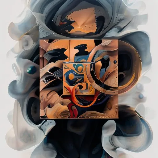
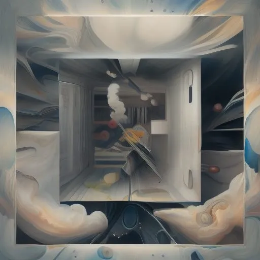
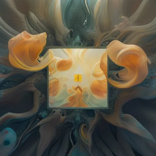
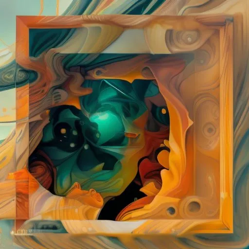
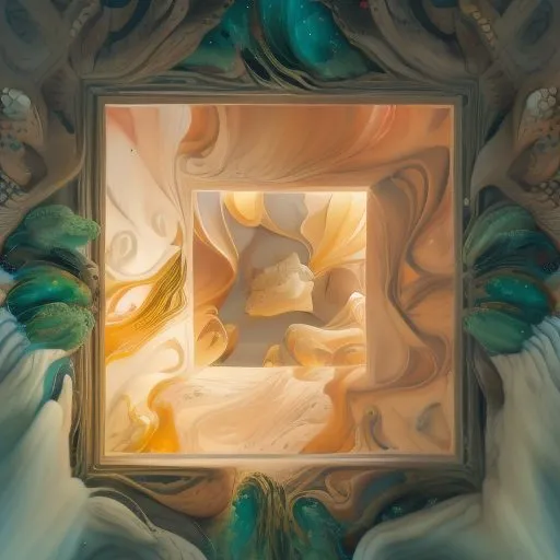
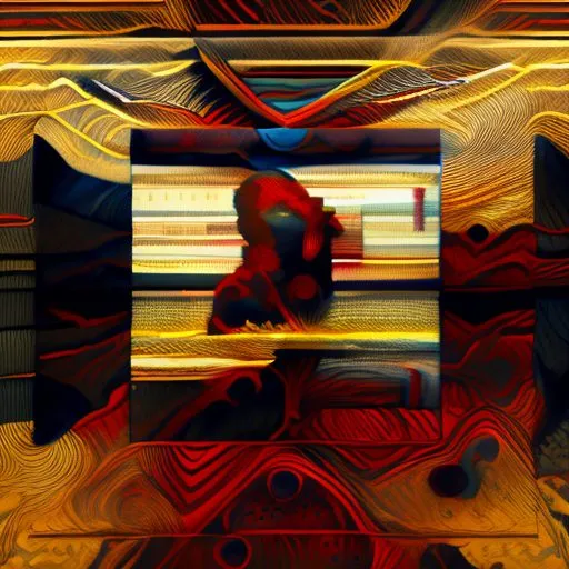
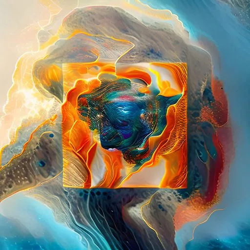
Selected outputs — work in progress